Design guest page: Appearance, images, and Contact Footer
Header image and colours, gallery, map, Contact Footer with Guest-Facing Contact Details, and the preview card in WhatsApp and iMessage.
Updated on November 12, 2026
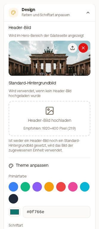
Design guest page
You set everything here in the editor of the guest guide: Guest Journey → Guest Pages → Edit.
Appearance: Colour, font, header, and cover image
In the Appearance tab of the editor, you set:
- Accent colour: for buttons, icons, and the stay card. Default is teal, with Custom colour you choose your own.
- Font: applies to headings and text of your guest guide. Default or one of seven other fonts.
- Header: Large photo, Compact photo, or No photo (then with your colour and your logo).
- Cover image: appears at the top of your guest guide. Recommended are 1920 × 820 pixels (21:9), JPG, PNG, or WebP, maximum 3 MB. Without a cover image, we show the photo of the respective unit.
- Hero text colour: for the text over the photo, light, dark, or a custom colour.
- Logo: appears at the top left. Your logo applies everywhere in Xentra, including on invoices and your website.
Custom CSS
Under Appearance, Custom CSS, you give your guest guide a completely unique look. It applies only to this guest guide, empty means default design. Images and fonts come only from Xentra storage, never from external servers (data privacy). Next to it is the Text for Claude or ChatGPT: copy with Copy text, paste into Claude or ChatGPT, attach screenshots or your website, paste the finished CSS here, and save. If something no longer fits, Reset CSS and then Save resets everything back to the default design.
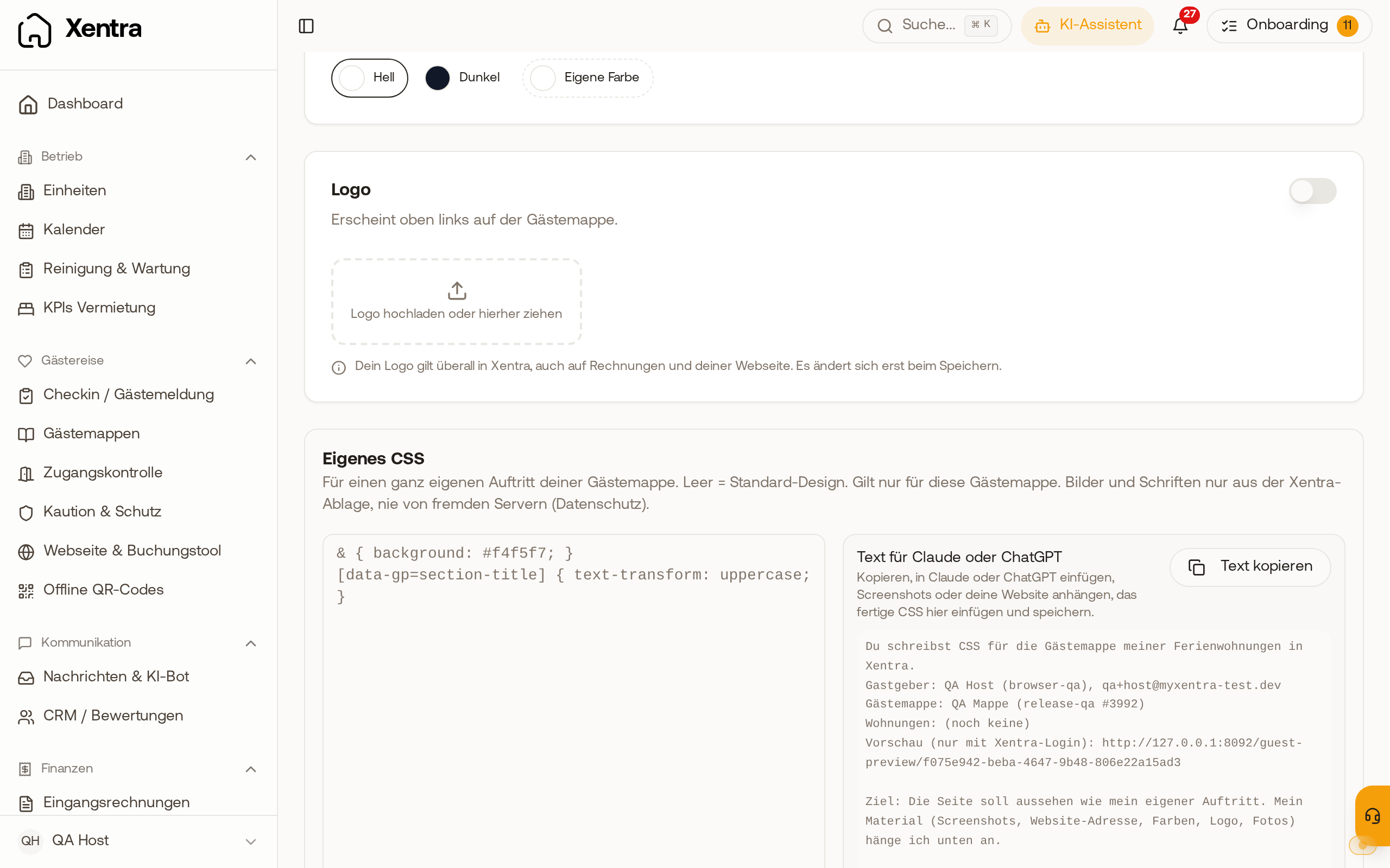 Under Appearance, Custom CSS: the field for your CSS and the finished text for Claude or ChatGPT.
Stay card
At the top of the guest guide, your guest sees the stay card with times, door code, Wi-Fi, and address. You do not set it under Appearance, but in the Content tab, Map block. Everything about this is in "Guest guide: the card at the top (stay card)".
Check the effect: save and click Preview at the top right. The preview opens in a separate tab. At the top, you select device, phase, language, a booking, and whether the online check-in is confirmed; via the moon icon of the guest guide, you also see the dark design.
Images and gallery
- In a text section: You insert images directly into the text. If several images are listed below one another, tap one of them and then Group images: This creates a gallery. At the top of the gallery, you select the layout: Carousel, Grid, or Collage.
- As a "Gallery" section: Add section, Gallery. There you upload multiple images (up to 5 MB each, they are automatically resized) and give each one a caption.
Guests swipe through the images of a gallery and open each image in full screen with a tap. An empty gallery does not appear to the guest.
Map and location
There is no separate field for a Google Maps pin. What matters is the address of the unit (Units): The map link in the header is created from it, and it fills the placeholder {{unit_maps_link}}. If the address is incomplete, the link is missing. For a specific pin (for example the house entrance), you link it in the text: select text → Insert link → insert your Google Maps link.
Contact Footer
At the end of every guest page, there is a contact block with photo, name, phone, email, WhatsApp, address, and website.
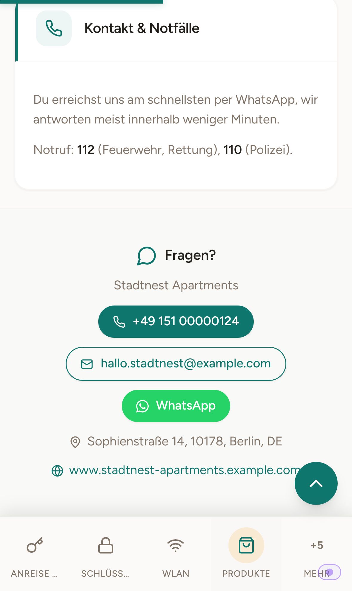 Guest page on mobile: Contact Footer with phone, email, and WhatsApp
Configurable per guest page (Block Appearance → Contact Footer): whether the footer appears and which details it shows, including the profile photo.
The values themselves cannot be configured per guest page. Phone, email, and WhatsApp come from Settings → Profile → Card Guest-Facing Contact Details (the link Edit in profile in the footer block leads there), photo and name from the same profile. They exist only once in the account. If the details of a manager or co-host should be on individual properties: turn off the footer there and create the details as a custom section at the top of the page.
Content blocks in text: Button, gallery, and more
In the Content tab, you insert content blocks into the text in any section via Insert: Gallery (multiple images to swipe, as grid or collage), Image + text, Note (a highlighted tip or warning), Collapsible (for example for questions and answers), Button, and Extra / product (an extra from your shop directly in the text, for example late check-out in the check-out section; appears as soon as you have created products). A Button is a link as a button, for example to directions, the menu, or your own website. After inserting, enter the address; you change the label directly inside the button.
Link preview in WhatsApp, iMessage, and co.
How the preview card is created when you send a guest page link can be found under Link preview in WhatsApp, iMessage, and co.